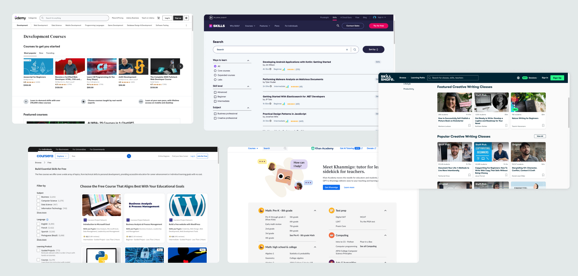
Training Academy web application

Project background

A training academy is an organized and structured educational institution or platform that delivers training and development programs to individuals/employees within an organization. The academy I worked with was an agrochemical industrial plant where the employees got training to operate the machinery, chemical equipment, and devices to ensure smooth and quality product.

Case study

CLIENT
Yara International
ROLE
UX Designer
UX Researcher
Tools
Figma
Adobe XD
Miro
Microsoft Teams
Slack
My responsibilities
My task was to do the research and design a web application with intuitive interface that gives a seamless experience to the user.
Team Structure
My task was to do the research and design a web application with intuitive interface that gives a seamless experience to the user.
the ask
The Training Academy app requires an intuitive interface for easy course discovery, engagement, progress tracking, and community interaction, ensuring accessibility across devices for a seamless learning experience.

Problem

The current training management process relies heavily on Excel for tasks such as adding and updating trainings, managing assessments, and maintaining records of training sessions. Notifications about new or upcoming trainings are sent via email, creating challenges for both employees and training ambassadors. Employees face difficulties in accessing previous trainings due to scattered information across emails, while training ambassadors struggle with the time-consuming task of manually updating records in Excel. Furthermore, Excel’s limitations in handling lengthy content lead to data loss, and the lack of a centralized system hinders efficient communication and accessibility. This outdated approach impacts productivity, data integrity, and overall user experience
the Goal
To create a centralized system that simplifies training management, ensures data integrity, supports extensive content, and automates notifications, enhancing efficiency and accessibility for employees and training ambassadors.

Design Process

Business Research

I started by understanding business requirements.

Kick off meeting

  1. To understand what the stakeholders are trying to achieve and any design assumptions they may have, I organized a meeting session.
  2. To get everything noted down I used FigJam, which helped me to quickly note down the current problem, business goal and metrics.

Business Goals

  1. The goal is to develop a comprehensive Training Academy app that offers diverse courses, fosters engagement, ensures credible assessment, and promotes affordability.
  2. The app should also help the trainers and the Department head to access the data easily and make any necessary changes when required.

Problem definition

  1. Excel-based system is manual and inefficient
  2. Training content is scattered across emails and spreadsheets. Difficult for employees to access training history.
  3. Limited space in Excel causes data loss for detailed training content.
  4. Manual notifications create communication gaps

Competitive analysis

I tried to understand the market, their trends and gaps.

Understanding the market

The competitive analysis focuses on similar training academies platforms, assessing their course offerings, interactive features, community engagement, and user experiences. This helps in understanding market trends, identifying gaps, and refining the Training Academy App's features to stand out in the competitive landscape. Analyzed four leading
E-Learning Platforms
Skillshare
Pluralsight
Khan Academy
Coursera

SWOT Analysis

Key Insights

Key Solution Components:
✓ Smart Content Management
✓ Organized learning paths
✓ One-click access to materials
✓ Comprehensive search function
✓ Automated enrollments
✓ Real-time progress tracking
✓ Smart notifications
✓ User Experience Focus
✓ Intuitive dashboard
✓ Visual progress indicators
✓ Mobile-friendly design
✓ Quick navigation

Key Benefits

✓ 80% reduction in manual tasks
✓ Enhanced data security
✓ Improved communication flow
✓ Seamless training history access
✓ Unlimited scalability potential

User research

I wanted  to understand the average Employee and Training Ambassador user’s profile based on the current learning platform.

Persona Creations - Employee

Employee Survey

User Interviews

  1. I interviewed 5 Employees to understand what issues they are facing and what keeps them motivated.
  2. All the 4 employees said managing their training program was getting harder.
  3. An efficient alternative would save them time and provide organized access to trainings.

Qualitative study

  1. I have asked open ended questions that would help me to identify specific user pain points.
  2. Based on the questionnaire I have used Qualitative Feedback Analysis to help me understand the current situation.

Insights

  1. Based on the Qualitative feedback analysis, I gathered the insights.
  2. All five employees expressed a preference for a personalized app.
  3. They also supported having an alternative, simpler way to communicate their technical growth.

Persona Creations - Training Ambassador

User Interviews

  1. I interviewed 3 Training Ambassadors to gain insights.
  2. 2 out of 3 said keeping track of every training data is tedious.
  3. All 3 said they were using Excel, which led to scalability issues and occasional data loss.

Qualitative study

  1. I have asked open ended questions that would help me to identify specific user pain points.
  2. Based on the questionnaire I have used Qualitative Feedback Analysis to help me understand the current situation.

Insights

  1. Based on the Qualitative feedback analysis, I gathered the insights.
  2. 2 out of 3 Training Ambassadors expressed a need for an alternative solution that would allow easy access to all data without scalability issues and prevent data loss.

Design plan

Overview

I reviewed the current approach of retrieving and submitting data. Here’s my professional approach on how to make it user friendly.

What's already in use

  1. Currently using Microsoft excel to enter the data.
  2. Emails or messages are the main source of communication.
  3. Sorting through emails for accessing training details.
  4. Submitting training data using grid system which does not accommodate content description.

How to improve

  1. Design a comprehensive training academy app.
  2. Role based content system which is relevant to the logged in user (Employee, Training ambassador, Department Head)
  3. Adding features like course exploration, Profile management, assessments, certifications, settings and support.
  4. Structured form to include new trainings with description and study materials.

Site Map

I created a site map by mapping all the sections to ensure an intuitive layout.

Brainstorming

I shared the insights with my team and invited them to a brainstorming session to explore how to map out the app.

After a several rounds of brainstorming we reached a clear conclusion.

Summary

Since we're following the agile methodology, we decided that the first step will be for me to design the low-fidelity landing page for all personas, and then we will move forward from there.

Design

Design, feedback and iterations.

Initial stages of design

I designed the lo-fi design screens based on the site map.
I designed a few screens as the discussion with the team. I gave a walkthrough of these lo-fi designs to the product owner and took the feedback.Before moving to hi-fi designs I made necessary changes in the lo-fi models..

High Fidelity Designs

I created the high-fidelity design and interactive prototype to provide the team and stakeholders with a clear understanding of the design.
The application has been developed using Microsoft Power Apps, utilizing pre-defined UI elements within the Power Apps framework. I've adhered closely to the existing design system, ensuring compatibility with Power Apps while delivering the user interface

Design Constraints

Challenges I faced while designing for low code - no code technology.

Challenges

  1. While Power Apps provides predefined templates and components, I had to design within these limitations
  2. Achieving a seamless mobile experience was challenging due to restricted control over layout adjustments, and ultimately, the mobile screen design was not pursued.
  3. I collaborated closely with the development team to create visually appealing designs.

Accessibilty

I want to ensure my design is universal and accessible.

WCAG Validation

I worked on the app to fully comply with industry’s Web Content Accessibility Guidelines

  1. Text size is legible and can be easily changed
  2. Content is not cropped.
  3. Optimal color contrast ratio.
  4. Tool tip used for additional guidance.
  5. Screens are not accessible on smaller screen sizes.

Usability Testing

I wanted to validate all the design assumptions from my design review and from stakeholders.

Scenario walkthrough

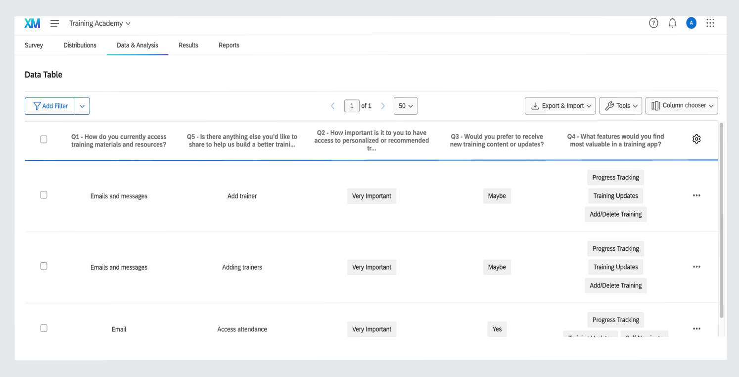
I conducted a remote moderated usability test with participants from various training designations.

I guided them through my designs, gathering their feedback throughout the session.

The goal of these tests was to confirm ease of navigation through the dashboard and ensure moving from the main site back to the dashboard was intuitive.

Business Sign off

To get approval from the business of our design changes for the development team to start implementing these.

Proving the value of design.

I prioritize demonstrating the business value of each design solution, supported by user research and usability testing.  

I invited stakeholders to observe usability testing sessions, allowing them to hear feedback directly from end users. This approach ensures that we validate assumptions collaboratively and with a fact-based perspective

Estimating work

Having completed a technical feasibility assessment with the developers, we were able to confidently estimate timelines for each stage of the project.

I presented an executive summary of the final user research findings, along with my recommendations for the management to prioritize.We planned future sprints, working in agile methodology.

Design Handover & QA

To make sure design is implemented to the best standard possible by collaborating regularly with the development team.

Working together

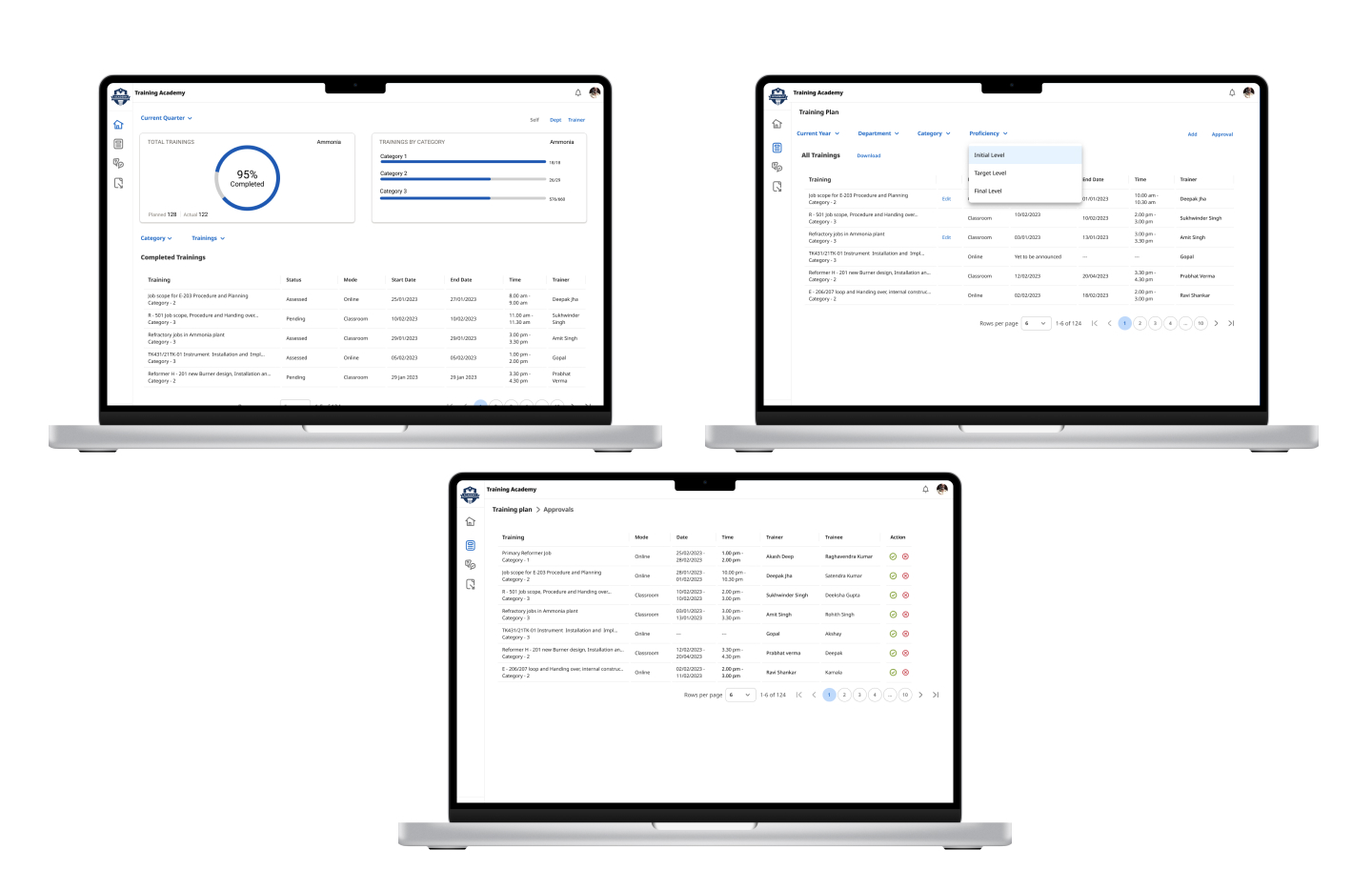
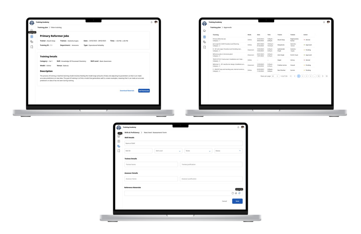
I prepared to handover all the assets to the developers to begin with the development.  These included user journeys, sitemap, content(copy, documents, images in all necessary formats and resolutions), font files, icons, wireframes and style guide.

I moved the finalized designs to development page in Figma and gave access to developers. This helped them to get the necessary details and also access the prototype.

Design QA

I arranged regular catchups with the development team to see if they needed anything else from me, what could be improved or compromised and run quality assurance on their latest implementation to make sure nothing was missed out.

Evaluation

Post Release Evaluation

I wanted to see the product performance, usability and user satisfaction.

Feedback

II wanted to ensures the product meets user needs, achieves business goals, and identifies areas for improvement.

This is a critical part of the product lifecycle, as it provides insights into the real-world impact of the design and functionality.

Next Step
After launch of the training app, we have continued to iterate and develop new features based on business objectives and user feedback
Want to see my more work?

View All the Projects